News
This constantly updated list features the latest and most important news articles, ranked in order of significance. The top stories highlight major developments, breaking news, and critical updates across various topics, ensuring you stay informed about the most pressing issues. As new articles are added, the list adapts to reflect the latest priorities, keeping the most impactful stories at the forefront. Whether it’s global events, technology breakthroughs, or industry trends, this dynamic list ensures you always have access to the most relevant and timely information.
-
Picture from o.aolcdn.com
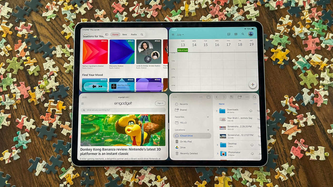
Rank 82851I’m not going to beat around the bush: iPadOS 26 and its new multitasking features are a game-changer for Apple’s tablets. Pretty much ever since Steve Jobs introduced the iPad 15 years ago (!), Apple has tried to straddle two worlds. In one, the iPad is a super-simple, easy-to-use tablet with a gorgeous display and tons of good apps from the App Store for gaming, entertainment and light work. The other world is one where the iPad replaces your traditional computer, letting people do the serious work that’s been typically reserved for a Mac or Windows PC. iPadOS has too often served as a hindrance to the latter goal over the years, particularly as the iPad Pro has gotten more powerful.
The Stage Manager multitasking experience Apple introduced with iPadOS 16 in 2022 was a major step towards making the iPad’s software suitable for power users — but it was rather buggy at launch and not as flexible as iPad power users were hoping for. The calls to just put macOS on the iPad grew louder. But this year, Apple took a different approach: it brought crucial macOS features like the familiar “stoplight” window controls, the menu bar at the top of the screen and vastly improved window management tools to iPadOS 26. The result is an iPad experience where you can easily jump between multiple windowed apps set up just how you like and one where you go full screen to focus on your content. It’s a massive refinement over the old Stage Manager experience and one that I think will finally satisfy iPad die-hards who want to push their tablets to the limit.
Before diving into the details, a quick word on betas and stability. As usual, Apple’s public betas feel pretty stable and capable, but that doesn’t mean you won’t run into weirdness here and there. App crashes, particularly with third-party apps, happened far more on this beta than with iPadOS 18. I’m confident those things will be ironed out as more developers update their apps for the new OS, but you’ll also run into things like UI inconsistencies and occasional stutters and jerkiness when jumping between apps. As we always say, think hard about what you’re willing to put up with to try a beta, even the relatively stable public beta. After all, the final version of iPadOS 26 will be out in just a few months.
Multitasking
Time for the nitty-gritty. When you update to iPadOS 26, you’ll be asked if you want to enable multitasking or have apps run in full screen mode only. When Apple says full screen only, they mean it. Past versions of iPadOS offered either Stage Manager or a basic, two-app split screen view with a third app available in a Slide Over window. The latter option is gone now, though you can still easily set up two or three apps side by side with iPadOS 26’s window tiling features. You can use multitasking mode or full screen only, with no in between. I think that’s a smart move, as plenty of people who use an iPad probably never use these multi-app features, and having a “multitasking on or off” toggle keeps things simple.
When you turn on multitasking mode, apps still open in full screen first — but you can grab any corner of the window to resize it or touch the top of the app and drag it around the screen. You could already do this with Stage Manager, so what really sets this new mode apart is how it interacts with other windows. Swiping up from the bottom of the display reveals the usual Home Screen view, but with your apps tucked to the side as a visual cue that you can add another app to that group. And, as before, you can move, resize and stack that app window wherever you want.
As I’m writing this, I have nine separate app windows open on my iPad, and getting around them feels more Mac-like than ever before. I can swipe up and hold from the bottom of the Home Screen and see every open app in a smaller window, which makes finding the specific thing I want a lot easier; I can also just command-tab through them. Apps can be minimized down to the dock and when I want the app back, it’ll pop open in the same size window and same placement as before. Swiping up from the bottom of the screen twice minimizes everything I have open to start fresh — but again, if I reopen those apps, they’ll go back to exactly where I had them set up before.
I realize it sounds kind of silly to make a big deal of this, but it’s hard to overstate how much this improves the iPad multitasking experience. With Stage Manager, I was never quite sure where an app would open or if it would be full screen or windowed. It can be useful for setting up multiple groups of apps, but adding and removing apps from that view was not terribly intuitive. Just opening everything in one space is a lot more intuitive. And if you want to have various different spaces with specific apps, you can still turn on Stage Manager. It’s a lot easier to add and remove apps from various different groups than it used to be; minimizing a window puts it into its own space that you can add more apps to (or just use it on its own).
There are a few other new components that make multitasking work as well as it does. These should be quite familiar to Mac users: The three-button “stoplight” controls and the menu bar. The stoplight buttons replace a similar three-dot window management system from older versions of iPadOS but are far more intuitive. The red one closes an app window entirely, the green one makes a window full screen and then yellow one minimizes it to the dock. These controls are crucial to making iPadOS 26 feel more flexible and fluid than ever before, particularly if you want to have more than one window of a single app open. I’ve also found them to be crucial when working with multiple apps on a smaller display, like on the 11-inch iPad Pro. Stage Manager usually felt like more trouble than it was worth on anything but a 13-inch iPad, but these new multitasking features make it easy to flip through a bunch of apps and pop into full screen if I need more space.
The expanded window tiling controls here also make that easier. If you press and hold the stoplight buttons, you’ll get more options to resize apps to take up a quarter, third or half the screen; you can also grab drag bars to further adjust how much space each app takes up. I really liked a mode where three iPhone-sized apps fill the screen, and when there was something I wanted to devote more focus to, I just hit its green button and went full screen.
The menu bar, meanwhile, is pretty easy to explain. If you swipe down from the top of the screen (or move your trackpad cursor up to the top) you’ll see familiar menus like File, Edit, Window and so on. It’s a handy way to find more advanced controls for an app, and it also keeps the various toolbars in apps from getting too overloaded with options.
Long story short, this all adds up to a wildly improved iPad experience. It doesn’t compromise the single-screen, focused mode that the iPad has always been known for, and it greatly improves working across multiple windows and apps. And unlike Stage Manager, which was limited to M-series iPads, these new multitasking features will work on any iPad that can run iPadOS 26, including the base A16 iPad and the iPad mini.
Everything else
If this was the only change to iPadOS Apple made this year, it would already be a worthwhile upgrade, but there are a bunch of other improvements coming this fall. These include an improved Files app, the Preview app that has long been a core part of macOS, the new Liquid Glass design, some potentially useful Apple Intelligence features, a nice set of updates to the Messaging app and a new Phone app.
Much has been said about Liquid Glass, with tons of prognostication about how Apple was ruining usability and throwing its UI back to 2006 in a blatant Windows Aero ripoff. As usual, the truth is much more nuanced. No one familiar with Apple’s software will be thrown off by this update — everything works as it did before, and while you’ll definitely notice some refractive visual elements, it’s not the wholesale change that aggrieved social media posters would have you believe. You can make things look very different if you, say, opt for the new clear glass icon look, but you can also leave the standard colorful iOS icons in place.
Over the course of the developer betas Apple has released since WWDC, the company has responded to feedback and reduced some of the transparency effects that were present in the first version of Liquid Glass — as it turns out, submitting feedback during a beta works! (Interestingly, they bumped some of the transparency back up in the fourth developer beta, right after turning it down in beta 3. This is still a work in progress.) Probably the biggest functional change is that app controls, toolbars and sidebars float over apps in a new, distinct layer rather than being wholly separate from an app’s content — but again, it’s not the kind of thing that’ll faze anyone who has been using an iPad or any other Apple device.
Preview isn’t exactly a thriller, but it’s a much better way to work with PDFs and images than the old interface that launched them in a separate Files window. You can still find PDFs in Files easily enough, but actually dealing with the document in a separate app is better than making Files pull double duty.
Speaking of Files, it has even more in common with the Mac Finder than before. You can now put specific folders in the dock for faster access to whatever you’re working on, and the app list view has resizable columns and collapsible folders, just like on the Mac. You can also add emoji and colors to folders for more visual differentiation (and, let’s be honest, a little more fun). And for the first time, you can pick specific apps to open different file types by default — so if you’d rather have PNG images open in Photomator than Preview, go nuts.
There are also major updates to the communication experience across the board in iPadOS 26. The FaceTime app got a nice redesign with large contact posters of your recent calls. But what’s most handy here is that the FaceTime app no longer tries to do double-duty with voice calls. A dedicated Phone app handles that now. Assuming you also have an iPhone, you’ll see all your recent voice calls and voicemails here and you can quickly place a new call through your contact list or using a traditional dialer. I’ve always liked the idea of being able to place calls on devices I’m using during the work day like my Mac or iPad, and this makes it far easier.
Messages is getting some fun visual enhancements like backgrounds for your conversations, but the thing I’m most interested in is message filtering. The app now identifies unknown senders and puts those messages in a separate folder, and there’s also a new spam folder where it drops messages that Apple strongly believes are spam.
If a message gets filtered into unknown senders or spam, you can mark it as known even if the contact isn’t in your address book and those messages will end up in your main view by default. The system also attempts to recognize when a message from an unknown sender is timely and needs to be delivered to your main inbox — something like a delivery person saying they’re nearby or other urgent content like a two-factor authentication code. This feels primarily like a phone-first feature; I get messages on my iPad, but haven’t seen much get filtered directly to spam or unknown callers yet. Once all my devices are running Apple’s latest software, we’ll see how that goes, but I’m still very excited about any feature that’ll help combat the deluge of spam messages that plague my inbox.
For more details on the updated communications experience and other new features like the Apple Intelligence-powered Live Translation, I’ll point you to my colleague Mat Smith’s iOS 26 overview. As is usually the case, nearly every feature coming to the iPhone this year is also coming to the iPad, meaning Live Translation will arrive on the tablet too.
There’s a lot more here that I haven’t been able to get to, like improved background tasks that let you export a video without keeping the app in focus, updates to Genmoji and Image Playground, the Journal app finally coming to iPad, Apple Intelligence-powered Shortcuts updates and much more. I’ll be continuing to check out how things change between now and the final release this fall, but even based on my experience with the recent beta, I’m quite pleased with where iPadOS 26 is at. The updates to multitasking are so significant that I can’t imagine going back to an iPad without them. This article originally appeared on Engadget at https://www.engadget.com/mobile/tablets/ipados-26-preview-a-long-awaited-multi-tasking-update-pays-off-so-far-172522054.html?src=rss
-

Picture from ichef.bbci.co.uk
Rank 82852 -

Picture from static.independent.co.uk
Rank 82853 -
Picture from cdn.mos.cms.futurecdn.net
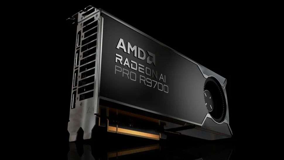
Rank 82854Radeon AI Pro R9700 confirmed for July 23 launch with 32GB GDDR6 memoryEarly partner listings show pricing between $1244 and $1277 depending on modelThe GPU is built for demanding workloads like AI, rendering, and local model inference workflowsAMD's Radeon AI Pro R9700, its fastest GPU to date, is on sale now, priced as low as $1,244.While AMD hasn’t confirmed exact pricing at the time of writing, recent listings from board partners, spotted by Benchlife, give a good idea of what to expect.The listings show Sapphire's models priced at $1,244 and $1,277, while ASRock's version, available to pre-order on Tech-America is listed at $1,267. That puts the probable midpoint at around $1,259.Built for professionalsFirst shown at Computex 2025, the R9700 is built on the RDNA 4 architecture and uses the Navi 48 GPU. (Fun fact: Its name is a nod to the original 9700 Pro made by ATI which outperformed Nvidia products back in 2002 and helped shift the market. AMD went on to acquire ATI a few years later.)The card comes with 32GB of GDDR6 memory, twice that of the Radeon RX 9070 XT, which shares the same core but is aimed at gamers.That memory runs at 20000MHz over a 256-bit interface, delivering 640GB/s of bandwidth, and could make a real difference for professional users working with big datasets, training models, or juggling multiple pro apps.By cutting down on memory swaps to RAM, the R9700 aims to keep things running smoother during demanding workflows.The dual-slot form factor and blower-style cooling are aimed at multi-GPU setups inside professional workstations.The card offers up to 47.8 TFLOPS in single-precision performance and up to 1531 TOPS in INT4 operations. It packs 128 AI accelerators and supports most modern media codecs, including AV1, H.264, and H.265 for encoding and decoding.The card connects via PCIe 5.0 and features multiple output ports, including DisplayPort 2.1a and HDMI 2.1b.Custom models from the likes of ASRock, Asus, Gigabyte, Sapphire, XFX, and Yeston will be available to buy in the coming months.These designs will include different cooling setups or small tweaks, but the GPU core and memory will remain the same.You may also likeAMD unveils Radeon AI Pro R9700, now a workstation-class GPU with 32GB GDDR6Rare AMD CPU powers this just-announced NAS offeringAMD just launched its 96-core Ryzen Threadripper Pro 9995WX CPU
-

Picture from static.independent.co.uk
Rank 82855 -

Picture from static.independent.co.uk
Rank 82856 -

Picture from image.cnbcfm.com
Rank 82857 -

Picture from ichef.bbci.co.uk
Rank 82858 -

Picture from ichef.bbci.co.uk
Rank 82859 -

Picture from static.independent.co.uk
Rank 82860 -
Picture from assets2.cbsnewsstatic.com
Rank 82861 -

Picture from techcrunch.com
Rank 82862 -

Picture from static.independent.co.uk
Rank 82863 -

Picture from static.independent.co.uk
Rank 82864 -

Picture from ichef.bbci.co.uk
Rank 82865 -

Picture from static.independent.co.uk
Rank 82866 -

Picture from static.independent.co.uk
Rank 82867 -

Picture from assets1.cbsnewsstatic.com
Rank 82868 -

Picture from assets3.cbsnewsstatic.com
Rank 82869 -
Picture from ichef.bbci.co.uk
Rank 82870 -

Picture from static.independent.co.uk
Rank 82871 -

Picture from image.cnbcfm.com
Rank 82872 -

Picture from static.independent.co.uk
Rank 82873 -

Picture from static.independent.co.uk
Rank 82874 -

Picture from assets3.cbsnewsstatic.com
Rank 82875 -

Picture from static.independent.co.uk
Rank 82876 -
Picture from static.independent.co.uk
Rank 82877 -
Picture from o.aolcdn.com
Rank 82878I've learned not to expect much from macOS updates — not through sheer cynicism, but from the obvious reality that Apple pays far more attention to iOS and iPadOS than its desktop platform. I get it. macOS is a thing of the past, while smartphones and tablets are Apple's profitable present and future. But still, I think Mac users deserve more than just widgets, or the ability to merely mirror their iPhones (a feature that's not only genuinely useful, but also cements how crucial iPhones are to Apple and its users today). Now with macOS 26, Apple is finally showing a bit more love to its laptops and desktops.
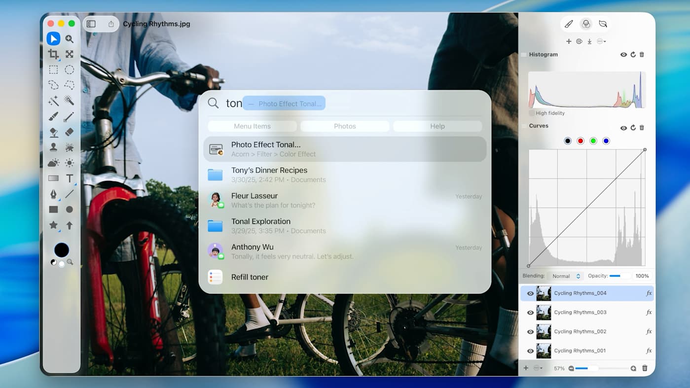
After testing the macOS Tahoe 26 developer beta for a few weeks, it definitely feels like a more substantial update than the last few versions. The revamped Spotlight alone will likely delight Mac diehards, since it makes it easier to find apps and perform all manner of tasks without requiring your fingers leave the keyboard. Add in a lovely visual refresh thanks to Apple's Liquid Glass design, as well as enhanced iPhone continuity features, and you have an operating system that feels like a genuine step forward for the Mac faithful.
(Ed. note: Apple just released the public betas for iOS 26, iPadOS 26, macOS 26 and watchOS 26. This means you can run the preview for yourself, if you are willing to risk potentially buggy or unstable software that could cause some of your apps to not work. As usual, we highly recommend backing up all your date before running any beta, and you can follow our guide on how to install Apple's public betas to do so.)
Spotlight becomes more than a search engine
I've never been a heavy Spotlight user, aside from the few times I've needed to quickly look for an app or file. But in macOS Tahoe 26, it's suddenly a lot more useful. Now Spotlight can also help you find specific files; search cloud file services and websites; run Apple shortcuts and automations; and even run basic commands, like looking up your recent screenshots when you type "/screenshot." Spotlight has become more than just a search engine for your Mac, it's practically a super-powered command line. (And notably, it has no real equivalent on Windows. So once again, Mac power users will be able to gloat about the supremacy of macOS.)
Apple
Over the course of my testing, tapping the command key and space bar to trigger Spotlight practically became second nature. I'd bring it up to find files, as usual, but I noticed that it was better at unearthing what I was looking for than before. Spotlight also replaced my usual practice of typing in search strings in Safari or Chrome's address bar. It takes just a few seconds to bring up Spotlight, type "YouTube," hit tab to trigger the search box and type in the video I'm looking for. This intelligent site searching also works for Amazon and IMDB — hopefully, Apple will add more commonly used sites over time (or perhaps just the ability to map a site's internal search engine to Spotlight).
If you're often buried by tons of tabs in your web browser, Spotlight can also quickly search through them. That helped me avoid getting distracted by social media and Slack conversations. I could just stay in my productivity flow, since I didn't have to sift through multiple app windows and tabs. The ability to trigger actions from Spotlight was similarly useful — it's a cinch to pop it up, start typing "Send Message" and jot out a quick text to my wife. Spotlight also learns your most common commands over time, so now I just have to type "se" for the Send Message action to pop up.
I'm sure for a certain type of Mac power user, Spotlight will give them far fewer reasons to ever touch their mouse or trackpad.
Apple
A more refined user interface with Liquid Glass
While Spotlight is the most powerful upgrade in macOS Tahoe 26, you'll notice the spiffier Liquid Glass interface first. As with iOS 26, it basically amounts to more transparencies and visual flourishes spread throughout the OS. The menu bar at the top of the screen is now fully transparent, instead of looking foggy like before. It's not much, but it does make your Mac's screen seem a little bigger (or perhaps that may have just been extra noticeable on the cramped 13-inch MacBook Air I've been testing on).
Similarly, widgets and the Control Center dropdown have more glass-like visual elements that make them look a bit more modern. There's no real practical advantage, but to paraphrase a classic Marge Simpson quote, I just think it's neat. Apple Silicon-equipped hardware has more than enough graphics power to spare, so these visual upgrades also don't hinder performance at all. I didn't notice any slowdown during my testing, and according to Activity Monitor, there didn't seem to be a big hit to CPU or GPU usage.
Apple
Better iPhone integration
Even though you've been able to make phone calls on Macs for a while now through FaceTime, it's taken until macOS Tahoe 26 for Apple to debut a dedicated Phone app. The app itself is nothing special — it gives you a quick glance at your contacts and recent calls, all in a compact Liquid Glass window — but at least it's a more logical place for phone calls.
Even better than the standalone app, though, is the addition of iPhone Live Activities appearing in the macOS Tahoe 26 menu bar. That makes it easier to keep track of an inbound Uber or Doordash order, without whipping out your phone. And if you need to tap into a specific activity, macOS will also automatically launch the app from your phone via iPhone mirroring. It's the sort of usability feature you'd expect from Apple, and notably it's also not easily replicable on Windows. (And sure, you can also view it as a way to keep iPhone users from straying to the dark side too.)
Other useful upgrades
The more I dug into macOS Tahoe 26, the more intriguing it became. Here are a few other updates worth highlighting:
The Shortcuts app seems a lot more powerful now, especially with the addition of custom automations and Apple Intelligence-powered actions. You can have an automation trigger writing tools or Image Playgrounds, and there's also a new "Use Model" command that can tap into on-device AI models and ChatGPT. I'm still trying to wrap my head around building a complex automation, but conceivably it could let you do something like compare an audio transcript to text notes, according to Apple.
Safari has received a Liquid Glass redesign that looks pretty polished. It's not nearly as transformative as the Safari iOS upgrade, which makes it easier to read websites on a small phone screen, but at least it looks nice.
The Notes app now has Apple Intelligence-powered reminders whenever you share content to it. That could help you unearth some key tasks from a large email.
The Photos app has also received the Liquid Glass treatment, and you can finally use Pinned Collections on Macs to keep your favorite photo groups handy.
The Apple Music app can now use AutoMix to intelligently blend songs together, similar to a DJ. I've been using this feature on iOS 26 a lot, and it's honestly delightful — so long as you're not a total gapless playback purist.
This article originally appeared on Engadget at https://www.engadget.com/computing/macos-26-beta-preview-spotlights-time-to-shine-171700779.html?src=rss
-
Picture from o.aolcdn.com
Rank 82879At WWDC 2025, Apple revealed a major visual shake-up for iOS (not to mention the rest of the company’s operating systems). This is the biggest change, aesthetically, since the shift away from the stitching, textures and skeuomorphic design of the iOS 4. It also comes with significantly fewer AI and Siri updates this time around. However, it’s the smaller touches that make iOS 26 seem like a notable improvement over its predecessor.
I’ve been running the iOS 26 developer beta for the last two weeks and here's how Apple’s new Liquid Glass design — and iOS 26 broadly — stacks up.
(Ed. note: Apple just released the public betas for iOS 26, iPadOS 26, macOS 26 and watchOS 26. This means you can run the preview for yourself, if you are willing to risk potentially buggy or unstable software that could cause some of your apps to not work. As usual, we highly recommend backing up all your date before running any beta, and you can follow our guide on how to install Apple's public betas to do so.)
Liquid Glass changes everything
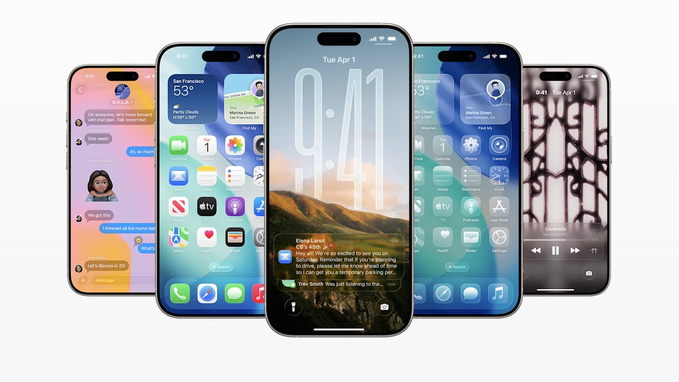
iOS 26 looks new and modern. And for once, how Apple describes it — liquid glass — makes sense: it’s a lot of layers of transparent elements overlapping and, in places, the animations are quite… liquidy. Menus and buttons will respond to your touch, with some of them coalescing around your finger and sometimes separating out into new menus.
Liquid Glass encompasses the entire design of iOS. The home and lock screens have been redesigned once again, featuring a new skyscraping clock font that stretches out from the background of your photos, with ever-so-slight transparency. There’s also a new 3D effect that infuses your photos with a bit of spatial magic, offering a touch of Vision Pro for iPhone users.
The experience in the first few builds of the iOS 26 beta was jarring and messy, especially with transparent icons and notifications, due to those overlapping elements making things almost illegible. Updates across subsequent releases have addressed this issue by making floating elements more opaque. There is also a toggle within the Accessibility tab in Settings to reduce transparency further, but I hope Apple offers a slider so that users can choose exactly how “liquid” they want their “glass” to be. If you own other Apple products, then you’ll come to appreciate the design parity across your Mac, iPad and Apple Watch.
One noticeable change I'd been waiting for was the iOS search bar’s relocation to the bottom of the screen. I first noticed it within Settings, but it reappears in Music, Podcasts, Photos and pretty much everywhere you might need to find specific files or menu items now. If, like me, you’re an iPhone Pro or Plus user, you may have struggled to reach those search bars when they were at the top of the screen. It’s a welcome improvement.
Visual Intelligence
Screenshot (Apple)
With iOS 26 on iPhones powerful enough to run Apple Intelligence, the company is bringing Visual Intelligence over to your screenshots. (Previously it was limited to Camera.) Once you’ve grabbed a shot by pressing the power and volume up buttons, you’ll get a preview of your image, surrounded by suggested actions that Apple Intelligence deduced would be relevant based on the contents of your screenshot.
Managing Editor Cherlynn Low did a deep dive on what Visual Intelligence is capable of. From a screenshot, you can transfer information to other apps without having to switch or select them manually. This means I can easily screenshot tickets and emails, for example, to add to my calendar. Apple Intelligence can also identify types of plants, food and cars, even. If there are multiple people or objects in your screenshot, you can highlight what you want to focus on by circling it. There aren’t many third-party app options at this point, but that’s often the case with a beta build. These are features that Android users have had courtesy of Gemini for a year or two, but at least now we get something similar on iPhones.
One quick tip: Make sure to tap the markup button (the little pencil tip icon) to see Visual Intelligence in your screenshots. I initially thought my beta build was missing the feature, but it was just hidden behind the markup menu.
More broadly, Apple Intelligence continues to work well, but doesn't stand out in any particular way. We’re still waiting for Siri to receive its promised upgrades. Still, iOS 26 appears to have improved the performance of many features that use the iPhone’s onboard machine learning models. Since the first developer build, voice memos and voice notes are not only much faster, but also more accurate, especially with accents that the system previously struggled with.
Apple Intelligence’s Writing tools — which I mainly use for summarizing meetings, conference calls and even lengthy PDFs — doesn't choke with more substantial reading. On iOS 18, it would struggle with voice notes longer than 10 minutes, trying to detangle or structure the contents of a meeting. I haven’t had that issue with iOS 26 so far.
Van life vlogger, bald or running for Congress?Image by Mat Smith for Engadget
Genmoji and Image Playground both offer up different results through the update. Image Playground can now generate pictures using ChatGPT. I’ll be honest, I hadn’t used the app since I tested it on iOS 18, but the upgrades mean it has more utility when I might want to generate AI artwork, which can occasionally reach photorealistic levels.
One useful addition is ChatGPT’s “any style” option, meaning you can try to specify the style you have in mind, which can skirt a little closer to contentious mimicry — especially if you want, say, a frivolous image of you splashing in a puddle, Studio Ghibli style.
Apple also tweaked Genmoji to add deeper customization options, but these AI-generated avatars don’t look like me? I liked the original Genmoji that launched last year, which had the almost-nostalgic style of 2010 emoji, but still somehow channeled the auras of me, my friends and family. This new batch are more detailed and elaborate, sure, but they don’t look right. Also, they make me look bald. And contrary to my detractors, I am not bald. Yet. This feels like a direct attack, Apple.
You might feel differently, however. For example, Cherlynn said that the first version of Genmoji did not resemble her, frequently presenting her as someone with much darker skin or of a different ethnicity, regardless of the source picture she submitted.
Still, the ability to change a Genmoji’s expression, as well as add and remove glasses and facial hair through the new appearance customization options, is an improvement.
A Camera app redesign for everyone
Apple has revisited the camera app, returning to basics by stripping away most of the previously offered modes and settings — at least initially — to display only video and photo modes.
You can swipe up from the bottom to see additional options, like flash, the timer, exposure, styles and more. You can also tap on the new six-dot icon in the upper right of the interface for the same options, though that requires a bit more of a reach. These behave in line with the new Liquid Glass design and you’ll see the Photo pill expand into the settings menu when you press either area. Long-pressing on icons lets you go deeper into shooting modes, adjusting frame rates and even recording resolutions.
What I like here is that it benefits casual smartphone photographers while keeping all the settings that more advanced users demand. None of the updates here are earth-shattering, though. I hope Apple takes a good look at what Adobe’s Project Indigo camera app is doing — there are a lot of good ideas there.
One extra improvement if you use AirPods: Pressing and holding the stem of your AirPod (if it has an H2 chip) can now start video recording.
Apple Music tries to DJ
Alongside the Liquid Glass design touches, the big addition to Apple Music this year is AutoMix. Like a (much) more advanced version of the crossfade feature found on most music streaming apps, in iOS 26, Music tries to mix between tracks, slowing or speeding up tempos, gently fading in drums or bass loops before the next song kicks in. Twenty percent of the time, it doesn’t work well — or Apple Music doesn’t even try. But the new ability to pin playlists and albums is useful, especially for recommendations from other folks that you never got around to listening to.
Messages get a little more fun
Image by Mat Smith for Engadget
Apple is making Messages more fun. One of the ways it’s doing so is by enabling custom backgrounds in chats, much like in WhatsApp. I immediately set out to find the most embarrassing photo of my colleague (and frenemy) Cherlynn Low and make it our chat background. I know she’s also running iOS 26 in beta, so she will see it. [Ed. note: Way to give me a reason to ignore your messages, Mat!]
Apple’s Live translation now works across Messages, voice calls and FaceTime. Setting things up can be a little complicated — you’ll first need to download various language files to use the feature. There’s also some inconsistency in the languages supported across the board. For instance, Mandarin and Japanese are supported in Messages, but not on FaceTime yet. In chats, if your system language is set to English or Spanish, then you’ll only be able to translate into English or Spanish. For those polyglots out there, if you want to translate incoming Japanese texts into German, you’ll need to set your device's language to German.
While I didn’t get to flex my Japanese abilities on voice calls and FaceTime, iOS 26 was more than capable of keeping up with some rudimentary German and Spanish. I’m not sure if I’d rely on it for serious business translation or holiday bookings, but I think it could be a very useful tool for basics.
There’s also the ability to filter spam messages to their own little folder (purgatory). Spam texts remain a nightmare, so I appreciate any potential weapons in the fight. Sadly, it hasn’t quite manage to deal with the TikTok marketing agencies and phone network customer services that continue to barrage my Messages. Still, hopefully Apple will continue to improve its detection algorithms.
One more tool in the battle against spam: You can mute notifications for Messages from unknown numbers, although time-sensitive alerts from delivery services and rideshare apps will still reach you.
New apps are hit-or-miss
Not everything in the beta lands, however. I’ve already touched on how Liquid Glass was initially a semi-transparent mess. The Games App, too, seems like an unnecessary addition. Because it’s a blend of the Games tab of the App Store and a silo of your preinstalled games, I’m not sure what it’s adding. It’s not any easier to navigate, nor does it introduce me to games I want to buy.
Cherlynn did want to highlight that for a casual gamer like herself, it’s intriguing to see if the Games app might start to recommend more mind-numbing puzzles or farming simulations. She was also intrigued by the idea of a more social gaming experience on iOS, issuing challenges to her friends. Still, because the phone she has been testing the beta on doesn’t have access to all her contacts or her gaming history, the recommendations and features are fairly limited at the moment.
Games is one of two new apps that will automatically join your home screen. (Fortunately, they can be uninstalled). The other is Preview, which should be a familiar addition to any Mac user. It offers an easy way to view sent or downloaded files, like menus, ticket QR codes and more. During the developer beta, the app pulled in a handful of my documents that previously lived in the Files app. Navigation across both those apps is identical, although Preview is limited to files you can actually open, of course.
AirPods, upgraded
This is more iPhone-adjacent, but iOS 26 includes several quality-of-life improvements for some of Apple’s headphones. First up: notifications when your AirPods are fully charged, finally! The Apple Watch got this kind of notification back in iOS 14, so it’s great to see Apple’s headphones catch up.
Apple is also promising “studio-quality sound recording” from the AirPods, augmenting recordings with computational audio improvements. There’s a noticable bump in audio quality. It appears that AirPods 4 and AirPods Pro 2 will record files at a sample rate of 48 kHz, which is double the rate used in the past. The sample rate bump happened last year, but it is dependent on what the app you're using. Is it “studio quality”? I don’t think so, but it’s an improvement. While recordings sound slightly better in quiet locations, the bigger change is in loud environments. The algorithm doesn't appear to be degrading audio quality as much while trying to reduce background noise.
iOS 26 also adds sleep detection to the buds. If the AirPods detect minimal movement, they’ll switch off automatically, which could be helpful for the next time I’m flying long-haul.
Wrap-up
In iOS 26, Apple has prioritized design changes and systemwide consistency over AI-centric software and features. While Liquid Glass is a big change to how your iPhone looks, Apple has drawn from user feedback to finesse the design into feeling less jarring and gelling better when the home screen, Control Center and Notification drop-downs overlap with each other.
There are numerous quality of life improvements, including Messages and Visual Intelligence, in particular. If anything, the AI elephant in the room is the lack of any substantial updates on Siri. After the company talked up advanced Siri interactions over a year ago, I’m still waiting for its assistant to catch up with the likes of Google.This article originally appeared on Engadget at https://www.engadget.com/mobile/smartphones/ios-26-beta-preview-liquid-glass-is-better-than-you-think-172155402.html?src=rss
-

Picture from static.independent.co.uk
Rank 82880 -
Picture from assets3.cbsnewsstatic.com
Rank 82881 -
Picture from ichef.bbci.co.uk
Rank 82882 -

Picture from static.independent.co.uk
Rank 82883 -

Picture from static.independent.co.uk
Rank 82884 -

Picture from image.cnbcfm.com
Rank 82885 -
Picture from ichef.bbci.co.uk
Rank 82886 -

Picture from ichef.bbci.co.uk
Rank 82887 -

Picture from static.independent.co.uk
Rank 82888 -

Picture from assets1.cbsnewsstatic.com
Rank 82889 -

Picture from cdn.mos.cms.futurecdn.net
Rank 82890Microsoft pays billions to inject manure underground to cancel out AI carbon emissionsVaulted Deep turns sewage and manure into a climate fix buried 5,000 feet downCarbon offset prices may drop, but right now, each ton costs around $350Microsoft is once again spending heavily on carbon removal - but this time, the strategy is not based on futuristic machinery or carbon-scrubbing forests, but instead involves waste, specifically human and animal excrement, manure, and agricultural byproducts.The company has entered into a multi-year agreement with Vaulted Deep to dispose of this organic material by injecting it underground.The method is designed to prevent decomposition from releasing carbon dioxide and methane into the atmosphere.An underground solution to an atmospheric problemAccording to Inc., Vaulted Deep will handle the burial of 4.9 million metric tons of waste over the next 12 years.While the company reportedly charges $350 per ton for carbon removal, CEO Julia Reichelstein clarified, “the mentioned price isn’t the actual sum that the tech giant paid” and added that costs are expected to drop over time.Still, if the listed price were accurate, the deal could exceed $1.7 billion in value, but at the moment, no exact figure has been disclosed by either side.The rationale behind this method is rooted in preventing the harmful effects of current waste disposal practices.“Generally, what happens to these wastes today is they go to a landfill, they get dumped in a waterway, or they’re just spread on land for the purpose of disposal. In all of those cases, they’re decomposing into CO2 and methane,” said Reichelstein.“That’s contributing to climate change. And then oftentimes, especially when it’s spread on land, all those pathogens are going directly into people’s groundwater.”Vaulted Deep’s process involves converting waste into a dense slurry and then pumping it more than 5,000 feet below the surface.This approach not only locks the material away from the atmosphere but also bypasses the ecological risks associated with surface-level disposal.The idea may seem unconventional, but it fits into a broader pattern of tech companies scrambling for scalable carbon offset strategies.Microsoft, along with other cloud giants like Google and Amazon, is confronting the environmental cost of data centers, facilities that require massive energy input, often from fossil-fuel sources.With AI workloads intensifying this demand, the need to find creative mitigation solutions has grown urgent.Earlier in 2025, Microsoft also partnered with AtmosClear to sequester 6.75 million metric tons of carbon dioxide, showing its willingness to explore different strategies.That said, it is unclear how scalable or sustainable the waste-to-carbon-offset method will be in the long term, especially if costs remain high and public perception turns critical.Via TomsHardwareYou might also likeThese are the best mobile workstations you can buy right nowWe've also listed the best mini PCs for every budgetThis is probably the best-looking mini PC with AMD's fastest AI CPU
-

Picture from static.independent.co.uk
Rank 82891 -

Picture from static.independent.co.uk
Rank 82892 -

Picture from static.independent.co.uk
Rank 82893 -

Picture from static.independent.co.uk
Rank 82894 -

Picture from static.independent.co.uk
Rank 82895 -

Picture from techcrunch.com
Rank 82896 -

Picture from ichef.bbci.co.uk
Rank 82897 -

Picture from image.cnbcfm.com
Rank 82898 -

Picture from ichef.bbci.co.uk
Rank 82899 -

Picture from static.independent.co.uk
Rank 82900